


Every time I come around to redesigning my website, I always find myself looking for inspiration. This usually comes from people who work at some of my favourite companies, or from websites put on a list. I aim to make finding inspiration for your portfolio easier with this article by including my 10 favourite websites that have given me design inspiration over the years. I'm also going to look for ones that aren't all over the web already so this hopefully won't just be a repeat of things you've already seen.
My best advice
The best advice I have to anyone looking to build their own porfolio website, is that the hero (top) section is the most important. This is the first thing people see when your website loads in so make it stand out. So many websites look the same and have lots of text, save all the writing for down the page, keep it minimal at the top. My top tips are:
- Don't cram too much information at the very top of the page
- Avoid using stock/generic illustrations for your hero, it's overused
- Don't sell yourself like a product, sell yourself like a person
The Top 10
Number 10: Chris Chin
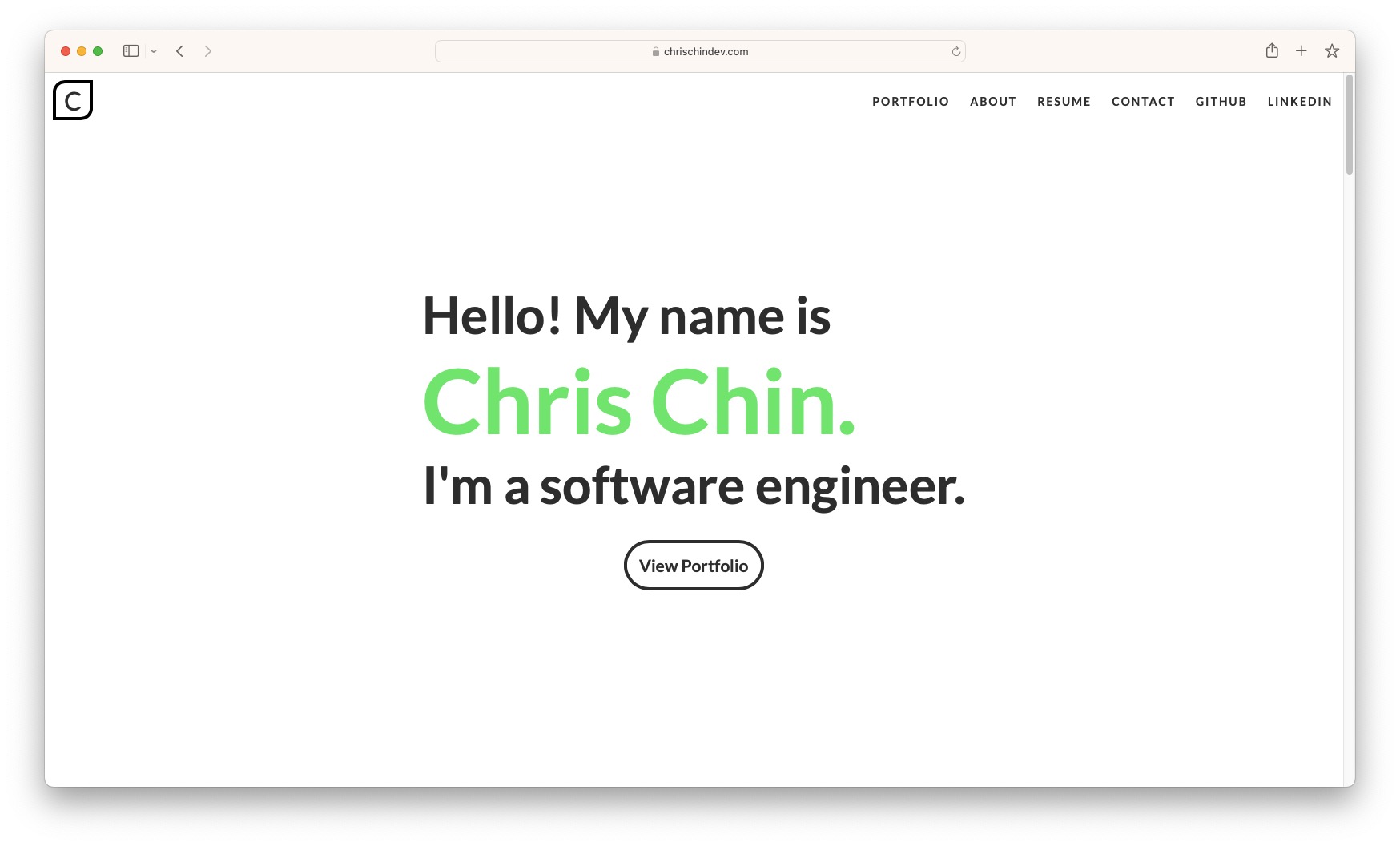 I mostly love this site because of the minimalist design of the hero section, the green & white colour scheme at the top works well and allows for the name to stand out, and the transparent navbar that doesn't get in the way is a nice touch too.
Number 9: Github Mona & Hubot Sans
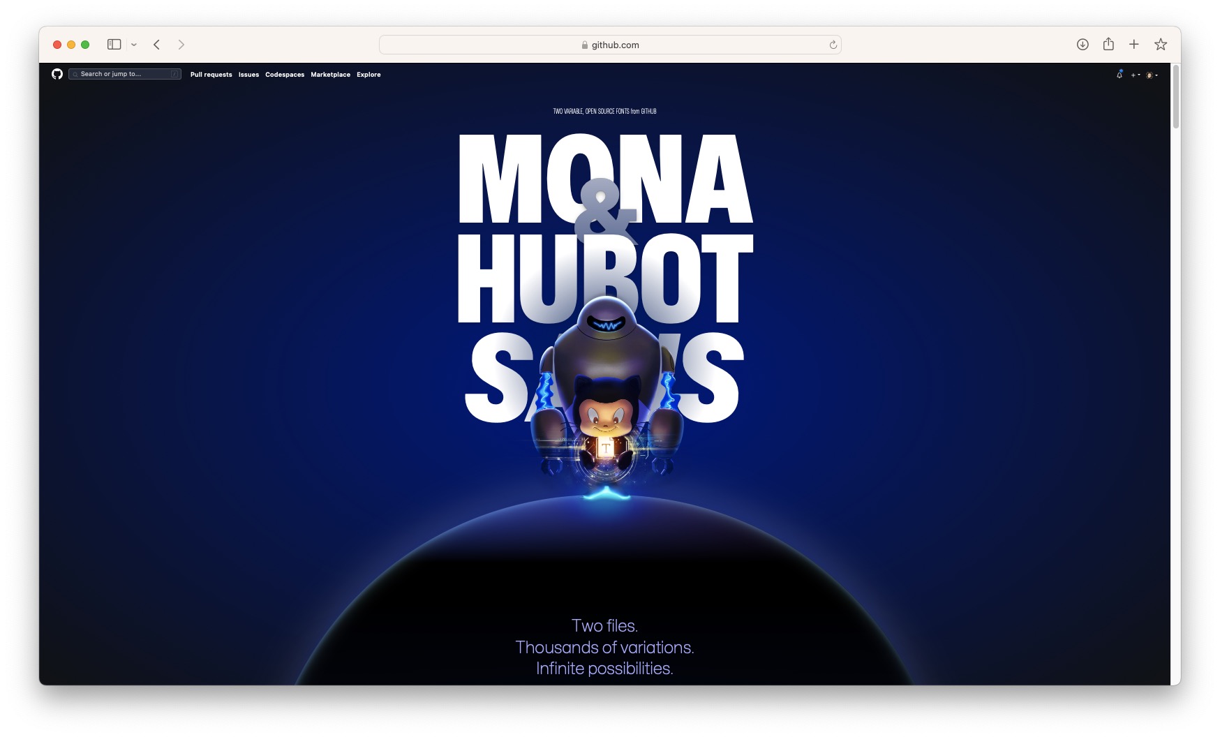 To start, I know that this is a website about a font, and not a portfolio, but I liked the design so much I feel it right to include it in this list. This site uses lots of scroll and hover based microinteractionsalong with looping animations to keep you engaged as you scroll down. The sections with a title on the left and more detail on the right was something that struck my eye that I chose to use as a design element on my website.
Number 8: Yul Moreau
 I like this site because the page is practically driven by scroll interaction. Videos and text moving smoothly with each scroll creates a satisfaction that basic websites don't achieve. The videos are a nice touch to engage people and is similar to something I had done on an old version of connorjarrett.com
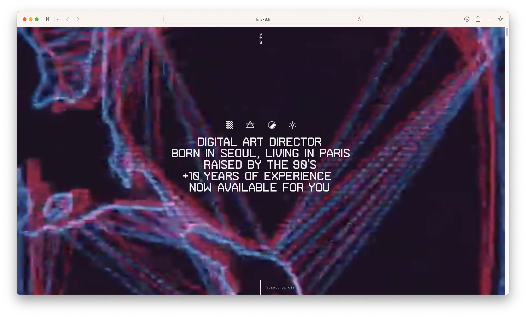
Number 7: Iuri de Paula
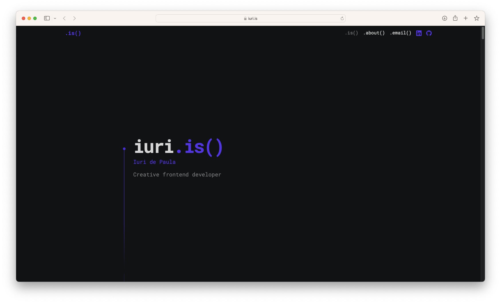 iuri.is was one of the first sites I saw online when designing my original website, and it gave me some inspiration. First of all, I love how scrolling down the page triggers animations unlike typical webpages, this immediately makes it more interesting to the viewer. I also love all the little animations to keep people engaged all the time.
Number 6: Nev Flynn
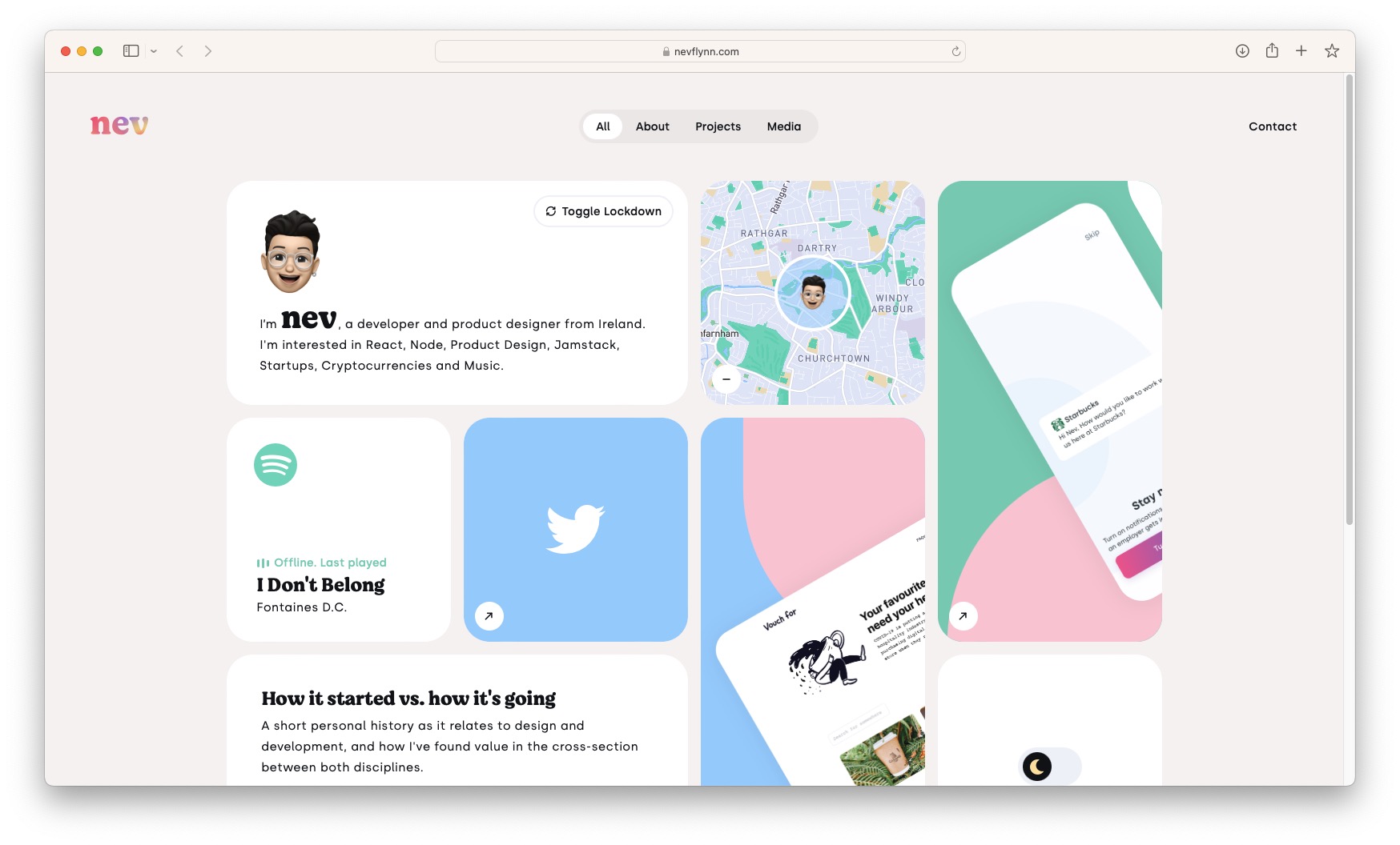 I love the design of this site for a few basic reasons. The big boxes with the rounded corners gives me vibes of Apple's product overview images at WWDC which I really like, and it gets across all the information really well. Links at the top rearrange the boxes as sort of filters which I also think is a nice touch.
Number 5: Van Holtz Co
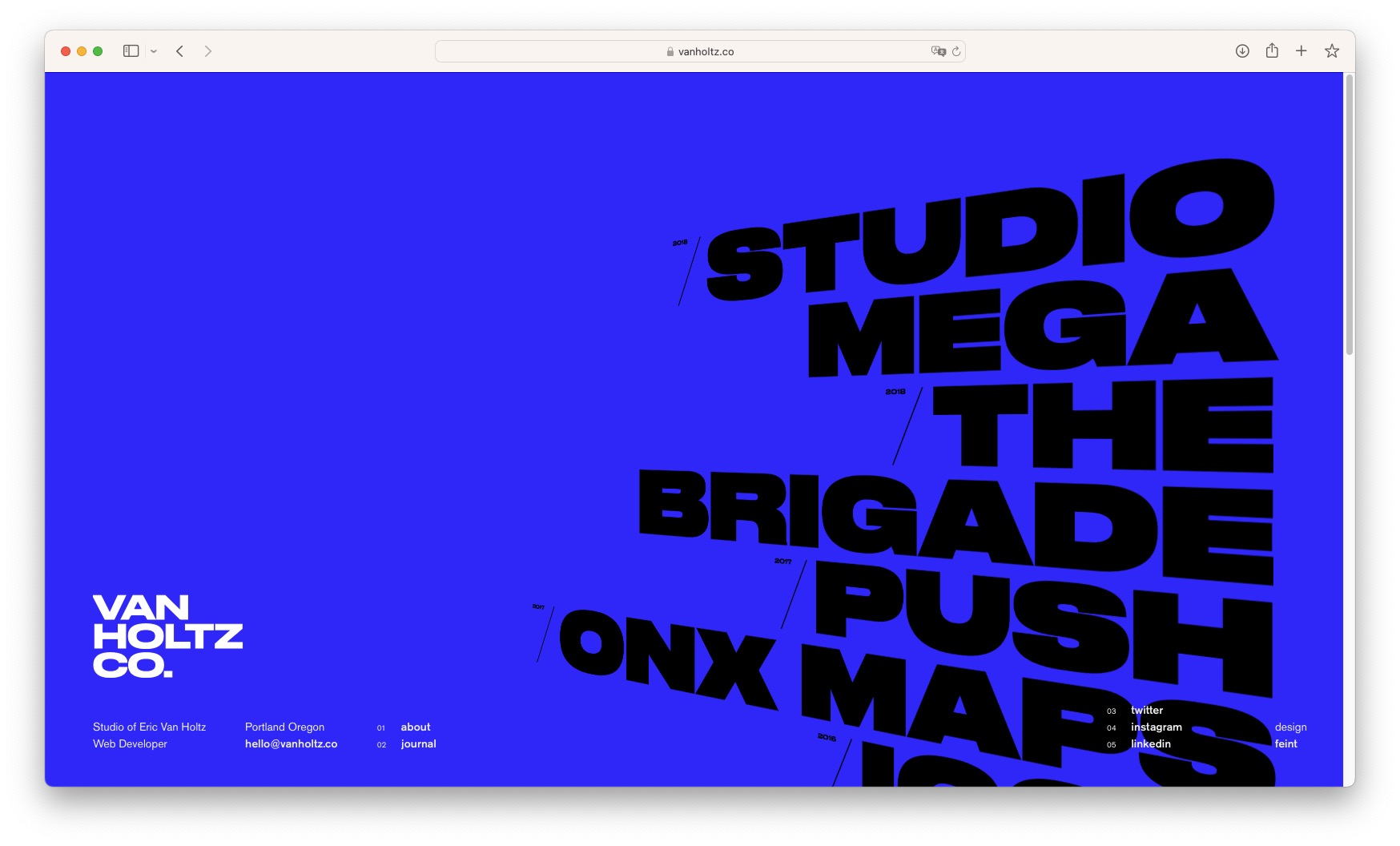 This website is great because on load you are met with a blue background which jumps off the screen, and big bold words running down the right side of the page acting as links. This means it avoids throwing too much information at the user, instead allowing them to click into a specific project and see more.
Number 4: Seyi
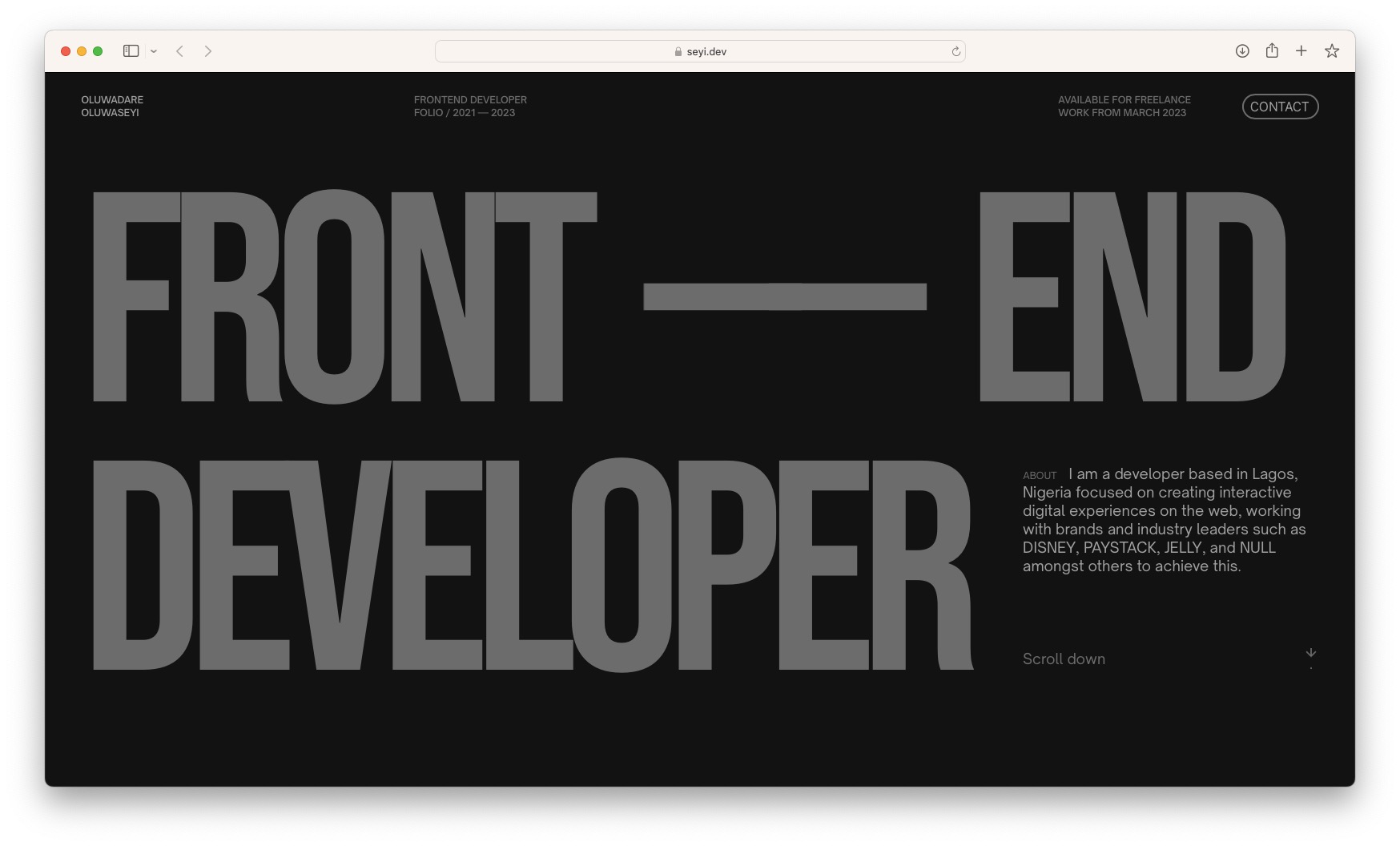 This website is great because it follows my number one rule for designing a personal portfolio, which is to avoid cramming everything at the top of the page. Instead, big bold letters fill up the screen, telling you immediately what they do without wasting time. They also have lots of scrolling interactions which is something I love because it makes you feel more connected to the site.
Number 3: Sang Han
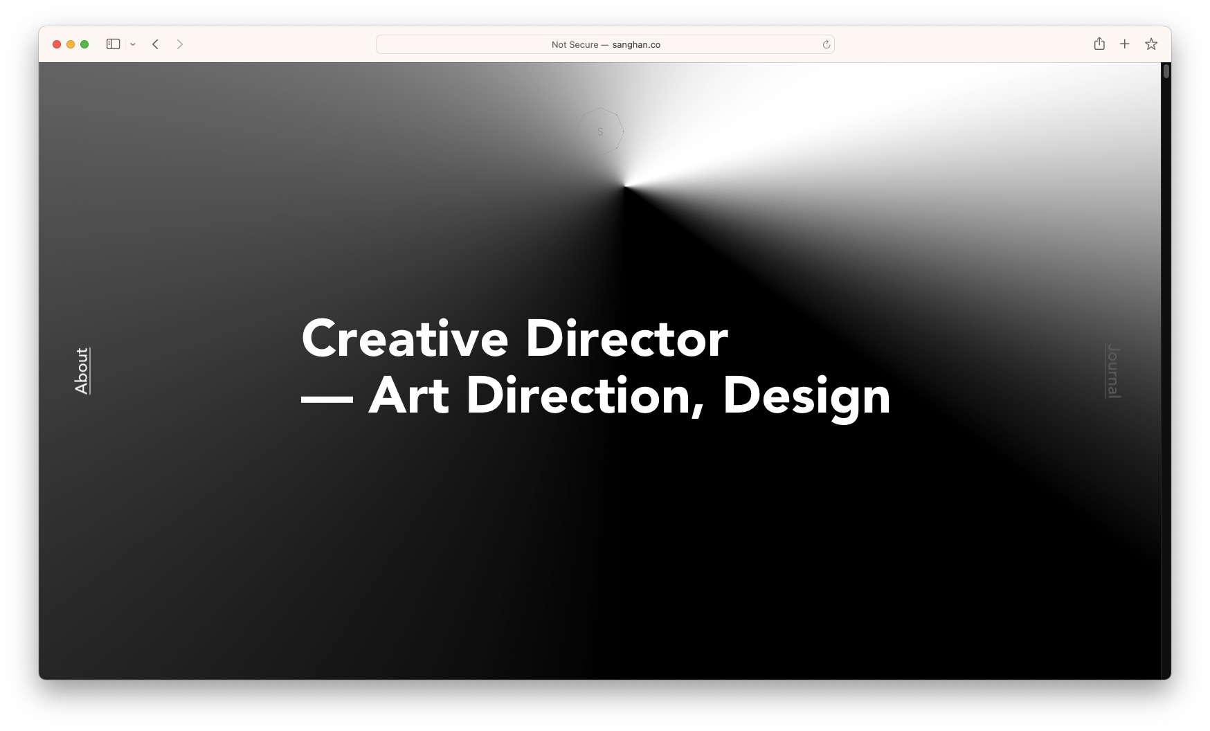 sanghan.co struck very well with me, I loved the dark colour scheme and minimalistic layout. Some of the text design and animations I chose to reflect in my own website. There were also lots of images which I found engaging.
Number 2: The Craftsmen
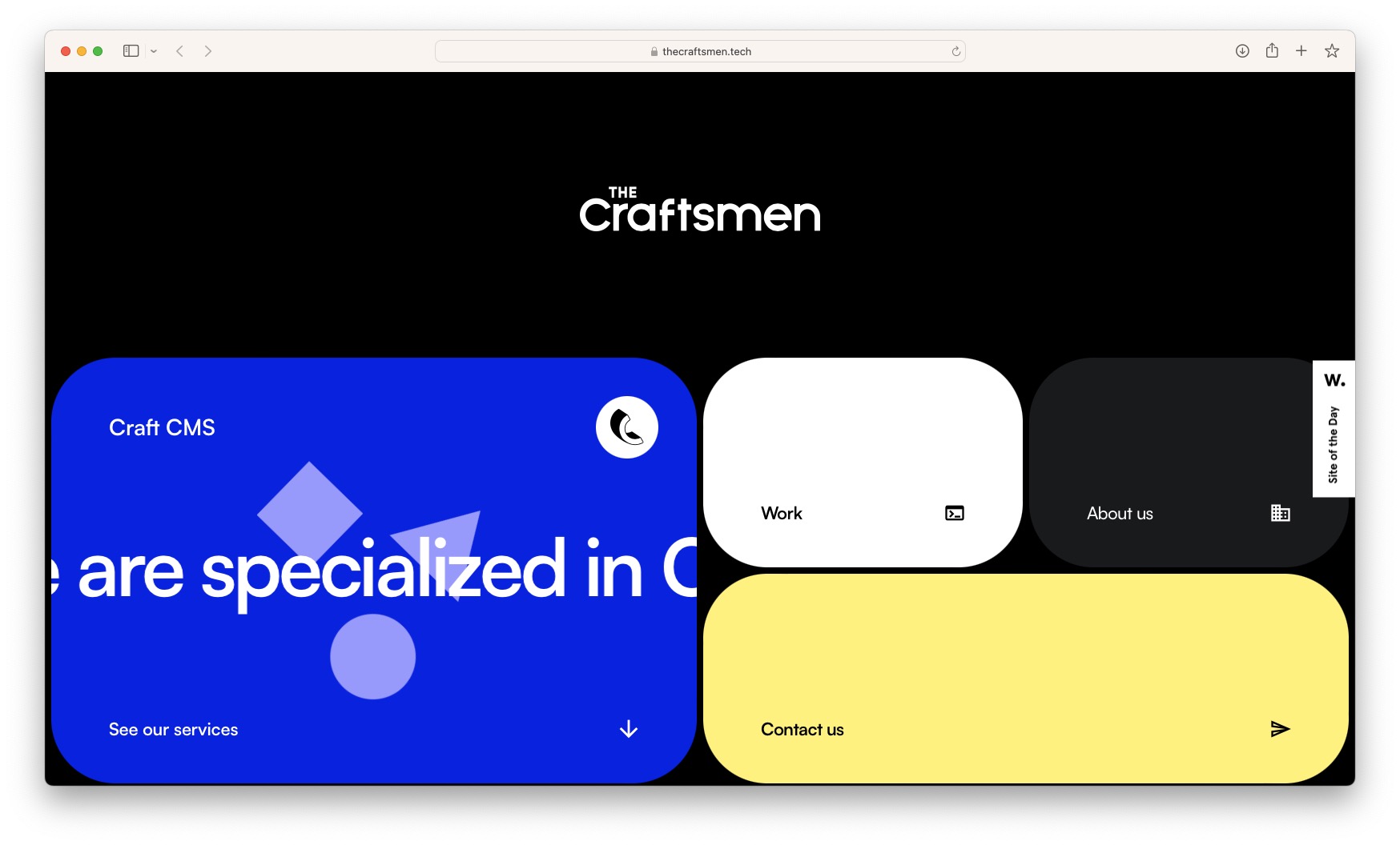 I simply love the design elements of this page, if feels like Android 12 came out of the phone and in to the browser. The use of rounded boxes on a grid looks very good to me, and I can't get over the smooth flow of going down the page. The colours are vibrant and stand out from the background so you can't really miss anything. I chose to reflect some elements of their scrolling mechanics in my own website too.
Number 1: Brian Lovin
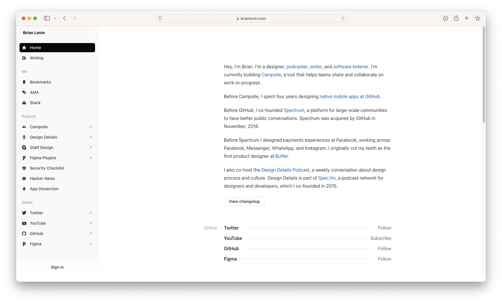 This site really is beautiful to me. It doesn't follow all of my "rules" that I stated earlier in this article, but gets the information across very well. No time is wasted and the first thing you see is a description of who he is with lots of links. As you scroll down more information is revealed like where he's based, his socials and where he's worked without having lines and lines of text, instead everything is straight to the point.
As well as all this, on the left, there is a sidebar that takes you to a bunch of useful links like his socials and projects, but also lists of the tools he uses, a Q&A page and a "bookmarks" section where he lists websites/apps he finds useful or fun, which I thought was a very creative touch.
Bonus: Uli Schöberl
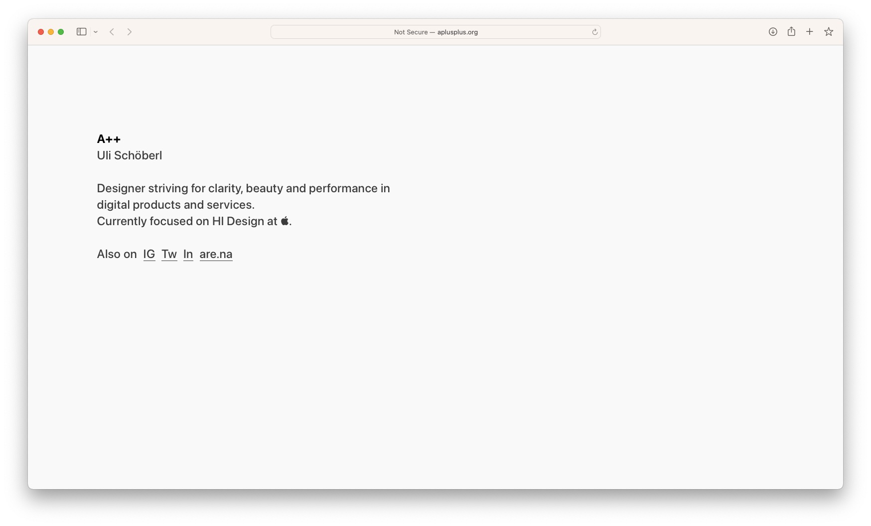 I'm adding this one in as a bonus site, because while I love the aesthetic, I wouldn't make a website like this myself. The page is very minimal, with a brief bit of information about the person and links with no distracting logos to the socials. It leaves everything in one place for the reader to find.
Conclusion
Remember that your portfolio is a representation of your work and your abilities, and it can make a significant impact on your career prospects. By taking the time to design a strong and compelling portfolio, you can increase your chances of landing the job or clients you desire. So don't hesitate to try out the suggested websites and tips to create a portfolio that truly showcases your talents.
When in doubt, just make sure you:
- Don't cram too much information at the very top of the page
- Avoid using overused stock/generic illustrations
- Sell yourself like a person, not a product
Good luck!