


Sometimes I think, have I run out of ideas when this week's post is all about a font? Aptos is the new default font for Microsoft Office. Most natives to Microsoft Office will be familiar with Calibri as the default font, but all great things must come to an end, so here it is, everything you need to know about Aptos, the new default font.
History
In April, Microsoft Design published an article on Medium about replacing Calibri. They previewed 5 new fonts: Tenorite, Bierstadt, Skeena, Seaford, and Grandview, and let the community give their feedback and thoughts on the different options.
The community largely agreed that Bierstadt, designed by Steve Matteson, was the best option. Steve had this to say about his creation:
Microsoft had requested a new typeface in the “grotesque sans serif” genre, a style defined by block-style letters without calligraphic flourish or contrast between thick and thin strokes. Helvetica, created by Switzerland’s Haas Type Foundry in 1957, is the most famed example.
Naming
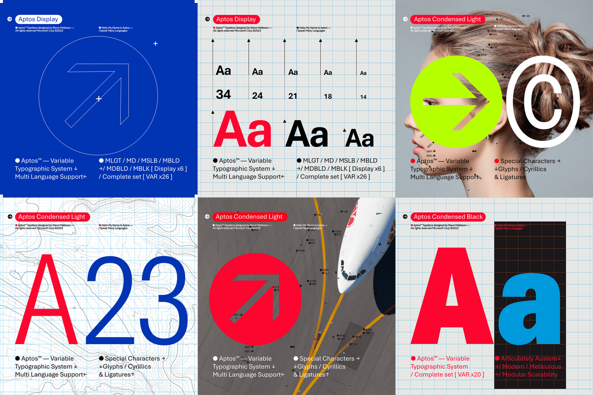
You may have noticed that Bierstadt is not Aptos. When Bierstadt won the vote, the designer, Steve Matteson, decided to rename the font to "Aptos" after his favourite unincorporated town in Santa Cruz for the reason that the town's landscape and climate represents the font's versatility.
Does this affect me?
Realistically, the switch to Aptos will mean nothing to almost everyone. The fact is most people won't notice, and even less will care. But, they are beginning the transition to Aptos today, and over the next few months, it will be available to all of you.